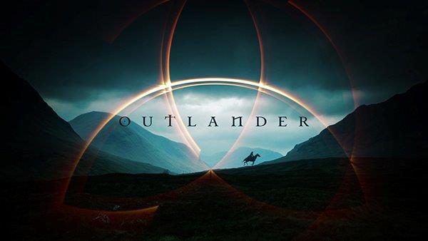
Long lost Outlander title sequences that were never chosen by Ron D. Moore? A never-before-seen Outlander mood board used to inspire the Season One title design ultimately chosen by Moore? A new Season 3 Outlander title sequence envisioned by fan video creator Julia LeBlanc? We’ve got all this and more in this post. It’s the time to drown our Droughtlander woes in a look behind the artistry, significance, and drama surrounding the Outlander Title Sequence.
First, a little bit about title sequences—those introductory images viewers see as the credits roll—and why they matter. The first moving images that accompany “The Skye Boat” song are as important to Outlander as the written script. According to Danny Yount, the Emmy award-winning title designer for HBO’s Six Feet Under, an audience now expects to feel something before a show starts, and not just be introduced to the cast. “You only have a moment to grab them,” he says. “It’s like putting dessert before dinner.”
For any new viewer, these initial images can be the difference between settling in or changing channels. Title sequences for television series play a pivotal role in establishing the show’s identity. The images and the music are usually repeated at the beginning of every new and rebroadcast episode, and have the ability (think Game of Thrones, The Brady Bunch) to be remembered for decades.
Title sequences can take a variety of forms. The metaphorical sequence, for instance, offers abstract images to establish themes (The Crown, Black Sails). The back-story sequence gives the viewer an eye into the premise of the story told through images or song (Beverly Hillbillies), or through voice-over (Star Trek). Sometimes, it’s only the song lyric that sets the series theme (Cheers) or instrumental (Taxi). Outlander seems to encapsulate all of the above, although with a little less emphasis on the metaphorical.
A title sequence contains a typographic logo in an appropriate font that usually remains static for the season, if not the entire series. Because it is developed before the series airs, the sequence will usually include visuals taken from early episodes. The Leftovers is an exception to most rules as the title sequence is dramatically different each season.
Some series, such as Outlander, make minor changes to the last image of each episode to superimpose a different episode title on each one. Others make minor alterations to the content of each sequence to reward attentive viewers (Game of Thrones). Outlander also adds new images to its titles each season.
Now, to be sure, Ron D. Moore is no slouch when it comes to choosing work from design agencies to represent his shows. Ten years previous to Outlander, Carnivale, which Moore executive produced the first season, won an Emmy for Outstanding Main Title Design in 2004.
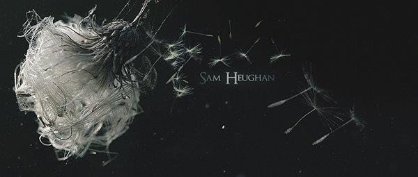
From what I’ve uncovered, two agencies originally pitched Outlander title sequences ideas to Moore and his producers. Ultimately, designer Alan Williams of Imaginary Forces won the right to create Outlander Season 1 title sequences with his backstory, more literal and figurative interpretation of the series.
You’re likely familiar with Imaginary Forces’s style if you’re a fan of Stranger Things (a Sam Heughan favourite) and Anne (of Green Gables).
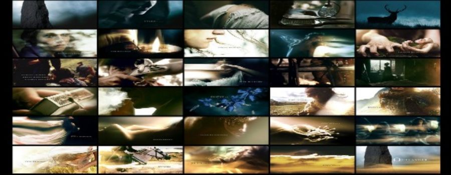
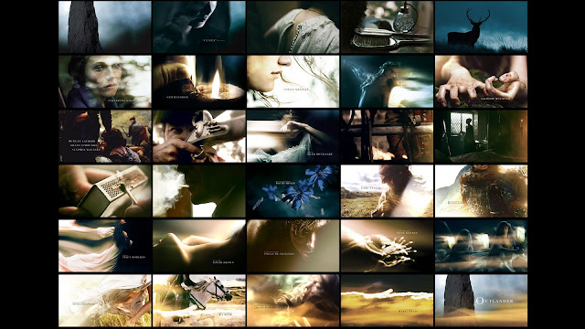
I contacted Williams at Imaginary Forces and, as a treat, he offered us the mood boards he used to inspire his title sequence for Outlander. Williams worked with Caitlin Van Horn and from her original work, you can see where the strong female protagonist imagery comes from, and why it might have contributed to Moore’s rationale. Here’s the board that captured Moore’s attention and from which the final title sequence came.
There’s a terrific analysis of the symbolic meaning of some of Outlander‘s first season title cards. For example, the stag (wild, independent, strong) could represent Claire. One of the (few) more positive critical reviews of the Outlander title sequence notes the abundant sunlight spilling into each scene to create natural art direction. It’s almost an amusing take on rainy Scotland (the main setting of the series), and most especially, it contrasts with the very first image shown in the show—the misty green grey Highlands.
Naturally, not everyone loves the choices that ultimately make up a title sequence. I know some fans love Bear McCreary’s “Skye Boat Song” but are disappointed with the accompanying images. If you’ve ever seen the titles for Game of Thrones or Black Sails, I can understand why. If you enjoy your art abstract or metaphorical, Moore’s ultimate choice may not be to your taste. Especially if you had wanted Outlander to appeal to the sci-fi/action/Scottish story more than just those seeking romance. But, I bet his second choice was. (Erin Conrad, blogger at Three If By Space, wrote about this right after the Season 1 premiere.)
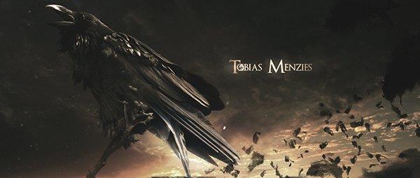
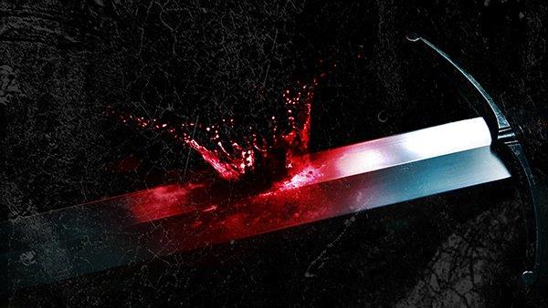
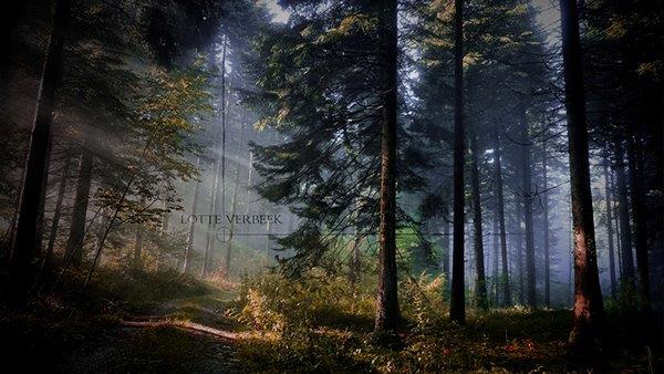
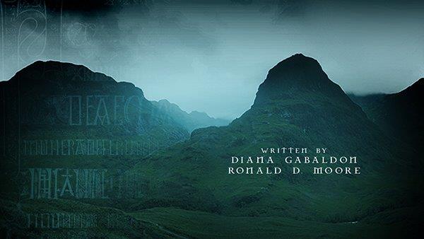
I also tracked down Matt Lawrence, formerly of MGFX Studios, who told me that he submitted four pitches to Moore and his team in Glasgow for that first season. He was told they came close to winning the contract.
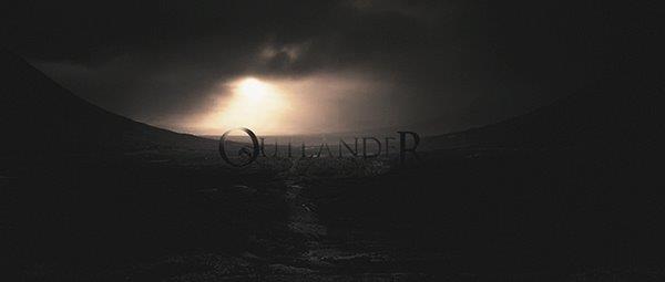
So here’s a visual feast of what Lawrence and his team submitted, what we never saw in the Outlander title sequence. (Just an aside: If only we could get access to casting interviews like we can title sequence pitches….)
The images rooted in the Scottish land!
The Celtic symbols and language!
The typeface!
Did you see that the blood spatter on the sword was in the shape of the crown?
Even if Moore picked well before, and even with the hauntingly beautiful “Skye Boat Song,” Outlander unfortunately has not received as much as an honourable mention for its title sequences. Not in 2014, 2015 or 2016 on the esteemed “Art of the Title” website or via the Emmys. But to be fair, in the context of a golden age of a whopping 420+ scripted TV series, Moore picking a winning design is even less likely now than it was 10 years ago.












5 Comments
Leave your reply.